Case study · Mobile app
Centralized Exchange · Crypto Trading App
A mobile exchange for buying, selling and watching crypto. I designed it so a first-time buyer can place an order without fear, while an active trader can read the market and act in a few taps.
Challenge
Trading apps are built for experts, and they scare everyone else away.
A centralized exchange has two very different people opening the same app. One wants to put a small amount into Bitcoin for the first time. The other checks the order book every morning and places limit orders between meetings. Most exchange apps serve the second person and bury the first under charts, tickers and jargon.
Every screen also carries real money, so a small mistake costs more here than in most apps. A mistyped quantity, a market order placed instead of a limit order, or a price that looks stale all break trust fast.
The goals for the redesign:
- Get new users to their first trade without needing to understand an order book first.
- Keep active traders fast: price, depth and the order form visible together, nothing hidden behind extra taps.
- Make every order easy to check before it's placed, so mistakes get caught on screen, not in the order history.
Approach
Design for two traders on one screen: show less by default, reveal more on demand.
I mapped the app around the three moments that matter on any exchange: checking my money, finding a coin, and placing a trade. Each moment gets one main screen, and the depth that pros need sits one tap deeper instead of on top.
- Home
- Market
- Coin chart
- Spot trade
- Review order
- Open orders
- Indicators
- Depth & order book
Solid steps are the path every user takes. Dashed steps are the extra detail active traders open when they need it.
When I open the app
I want to see how my money is doing
So I know if I need to act today
When a coin starts moving
I want to find it and its price quickly
So I don't miss the moment
When I place an order
I want to see the price, amount and total together
So I'm sure it's the trade I meant
When I study a chart
I want my usual indicators one tap away
So the chart stays clean until I need them
Process
Five decisions that shaped the app.
Home answers "how am I doing?" first
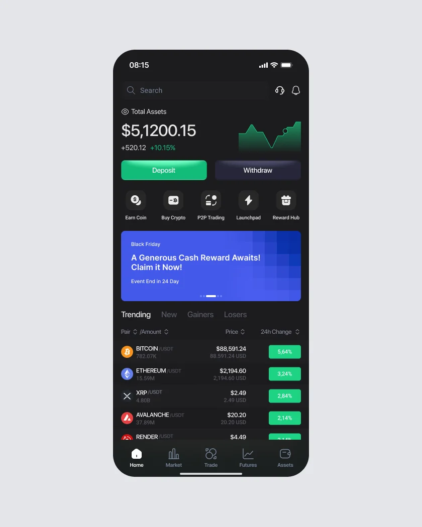
Total assets and today's change sit at the top with a small trend line, and the balance can be hidden with one tap for people who trade in public. Deposit and Withdraw are the two biggest buttons on the screen, because moving money in and out is what new users look for first. Shortcuts like Buy Crypto and P2P Trading sit below, and a trending list shows what the market is doing without leaving home.
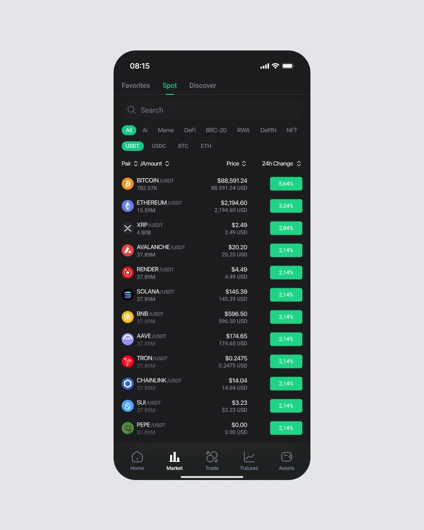
The Market tab is built for scanning. Every row reads the same way, left to right: coin and volume, price, then 24h change as a solid color block, so the eye can sweep down the column and spot movers fast. Filters for categories like AI, Meme and DeFi and quote currencies like USDT and BTC sit above, as chips you can tap with a thumb.
The order book and the order form, side by side
On most mobile exchanges you flip between the order book and the order form, and lose your place each time. I put them next to each other: asks in red and bids in green on the left, with depth bars showing where the volume is, and the last price in between. The form on the right starts with a clear Buy or Sell switch, so the direction of the trade is never in doubt.
Tapping any price in the book fills it into the limit field, so a trader can act on what they see. Quantity has 25%, 50%, 75% and 100% shortcuts based on the available balance, and the total updates live in USD under every field. Before the Buy button, the user always sees the price, the quantity and what it will cost.
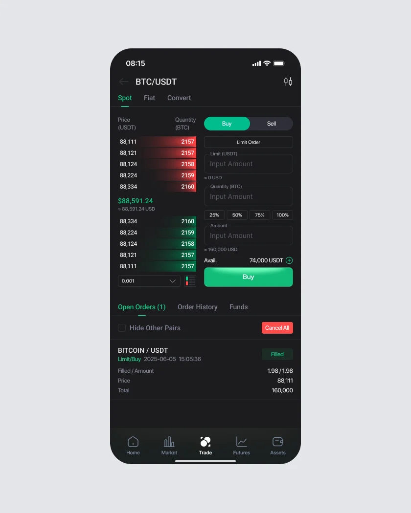
After the order is placed, it shows up right below the form under Open Orders, with its status, filled amount, price and total. Cancel All is there, in red, for the moment the market turns.
A chart that stays clean until you ask for more
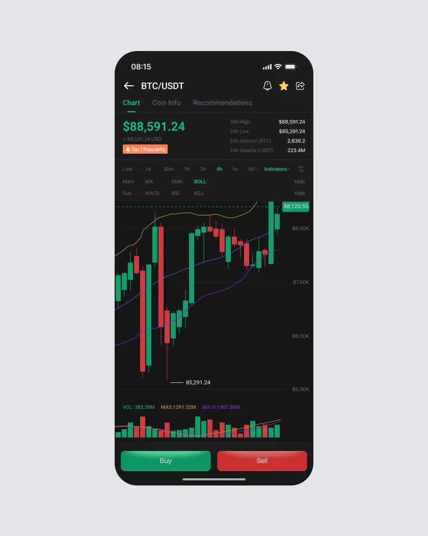
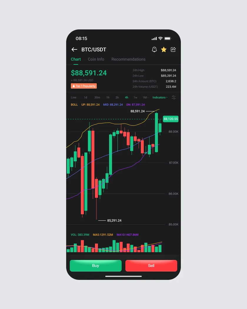
The coin page leads with the price and the 24h high, low, amount and volume, then a candle chart with clear high and low markers and the current price pinned to the right edge. Timeframes sit in one row, from line to one month.
Indicators are where most charts get cluttered, so they live behind a single Indicators toggle. It opens a small panel with main indicators like MA, EMA and BOLL and sub-chart ones like MACD, RSI and KDJ. Once picked, the panel closes and the indicator's values sit in one line above the chart. Buy and Sell stay fixed at the bottom of every chart view, so the decision is always one tap away.
Market depth people can actually read
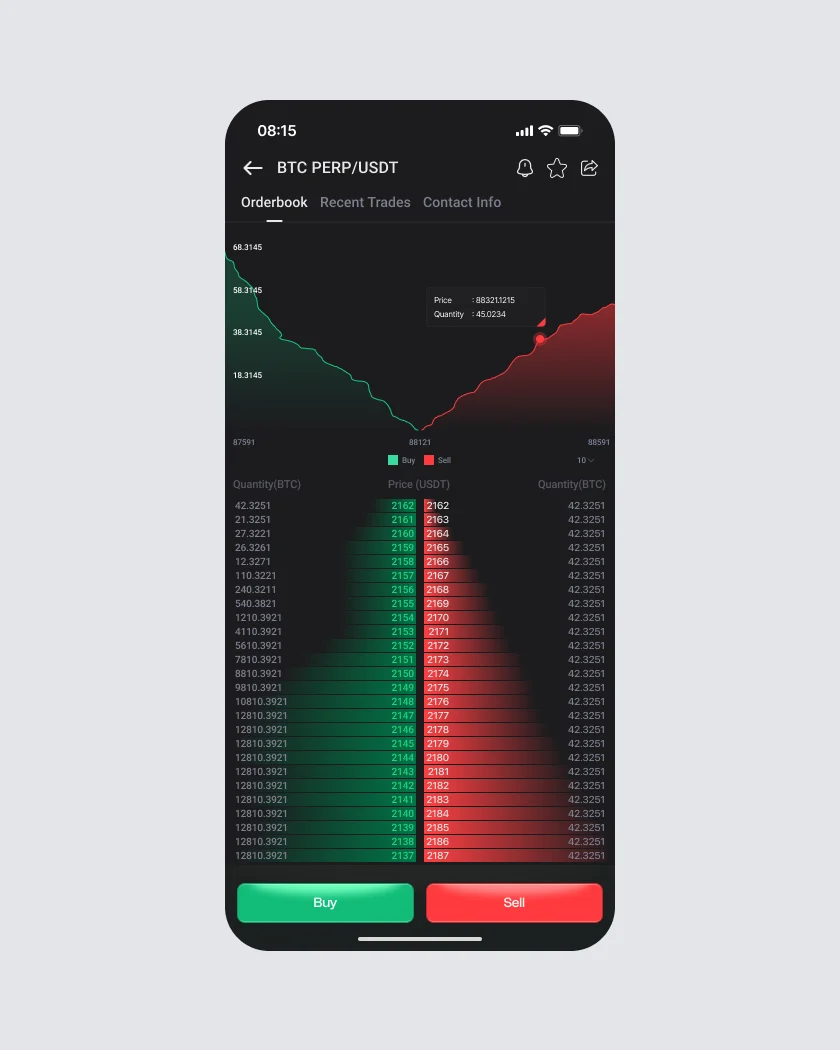
For perpetual futures, traders want to see where the walls of buy and sell orders are. The depth chart shows bids and asks as two mirrored curves meeting at the mid price, and dragging along it shows the exact price and quantity at any point. Under it, the full order book lines up bids and asks on one row each, with bars that grow with volume, so imbalances jump out without reading every number.
A dark system where color always means something
Traders stare at these screens for hours, often at night, so the app is dark by default with soft grays instead of pure black. Color is saved for meaning: green is buy and price up, red is sell and price down, and nothing else uses them. That rule is why the order book, the change column and the Buy and Sell buttons read instantly. Numbers use tabular figures so prices line up in columns, and every money field shows its USD value underneath.
Green · buy, upRed · sell, downGray · everything else
Result
One app that a first-time buyer and a daily trader can both trust.
The final design covers home, markets, spot trading with an in-place order book, charts with indicators, futures depth and order history, built on one dark component system with shared rows, fields and buttons. Prototypes of the trade and order book flows were used to walk the team and developers through every state before build.
What I'd measure after launch
- How many new users place their first trade within their first session.
- How often orders are cancelled within a minute of being placed, a sign of input mistakes.
- How often traders tap a price in the book instead of typing it.