Case study · Mobile app
Fashion E-commerce App
A mobile store for a streetwear label. Browsing should feel like flipping through a lookbook, and going from "I want this" to "order placed" should take a few taps, not a few forms.
Challenge
People buy clothes with their eyes, but most store apps make them read.
Clothing is bought on look and fit. Small thumbnails, a filter page that hides what you picked, and a checkout that asks for everything at once all push shoppers to leave with items still in the cart.
The label sells a small, curated drop of jackets, jerseys and accessories, so every product needs room to be seen. The brief came down to three jobs:
- Make the collection feel premium on a phone screen, without slowing people down.
- Help shoppers narrow down fast by category, size, color and fabric.
- Remove friction after the decision: cart, address, payment, tracking and reviews.
Approach
Design the whole journey, including the moments that go wrong.
Instead of polishing a few hero screens, I mapped every step a shopper takes, from opening the app for the first time to writing a review after delivery. Then I designed each step together with its unhappy paths: no search results, an empty cart, deleting an item, a cancelled order.
- Welcome
- Sign up
- Home
- Categories
- Search
- Filter & sort
- Product
- Cart
- Address
- Payment
- Order placed
- Order tracking
- Review
- No results
- Empty cart
- Confirm delete
- Empty favorites
- Order cancelled
- Item unavailable
Top: the main path. Dashed: some of the edge states designed alongside it.
Process
Five decisions that shaped the app.
Let the product photos do the selling
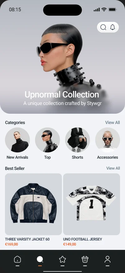
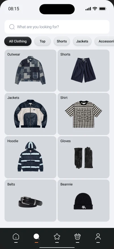
Home opens on a full-width campaign image, with categories as round portraits and best sellers as large cards. Every product sits on the same soft gray background, so a jacket and a beanie feel like part of one collection, not a messy catalogue.
Filters you can see, and undo in one tap
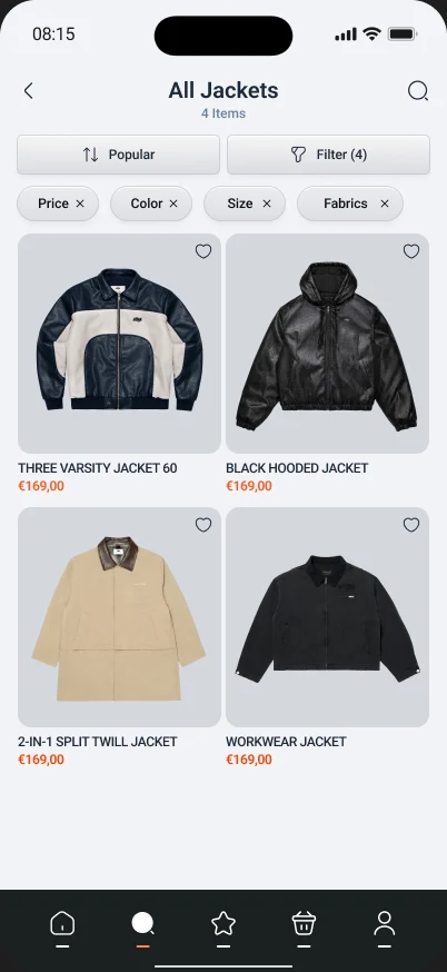
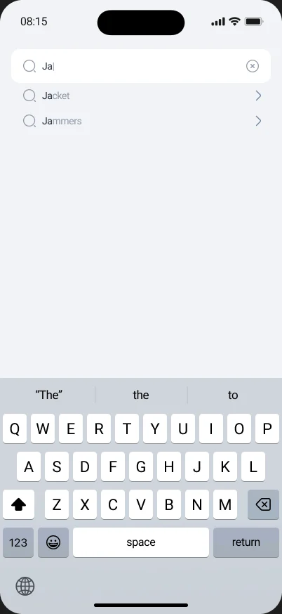
On the product list, every active filter stays visible as a chip under the title, each with its own ×. The item count updates right away, so shoppers always know why they are seeing four jackets and not forty. Search suggests matches as you type, so people rarely land on an empty page.
Keep the cart clean, and never a dead end
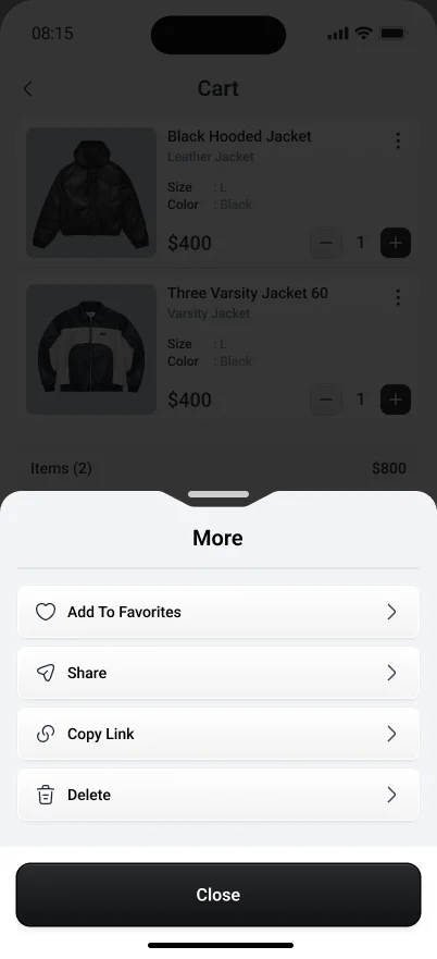
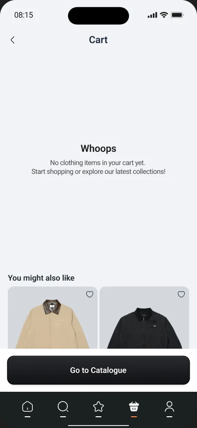
Each cart item shows only what matters for the decision: photo, size, color, price and quantity. Less common actions (save to favorites, share, copy link, delete) live in one bottom sheet. An empty cart doesn't just say "nothing here", it suggests items and points back to the catalogue.
A checkout that confirms every step
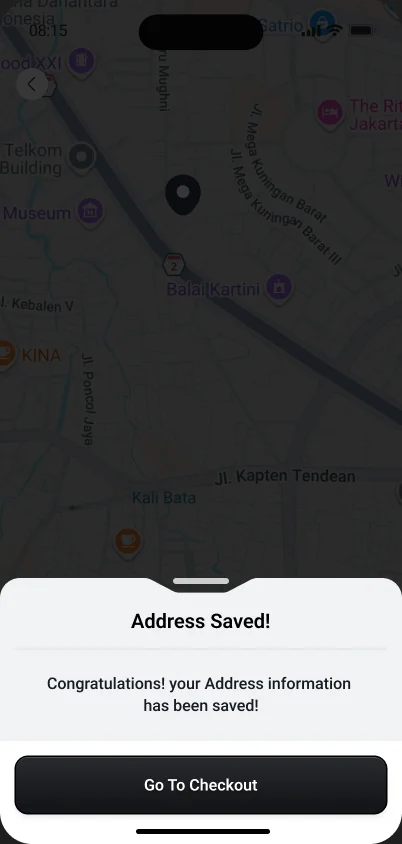
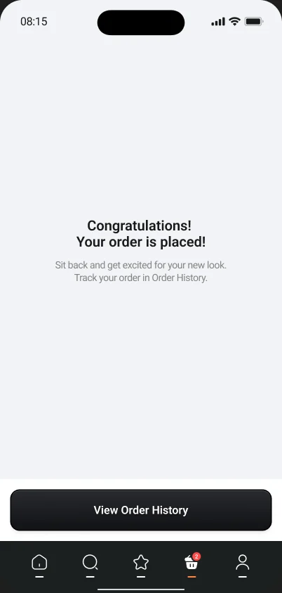
Checkout is split into short steps: recipient, shipping address, payment. The address is picked on a map, then confirmed with a sheet that leads straight back to checkout. After paying, a calm success screen tells people what happens next and where to track the order.
Reviews with real photos build trust
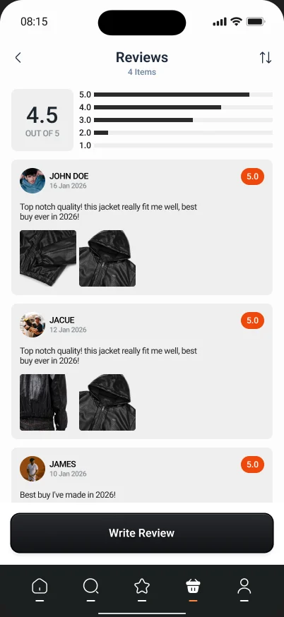
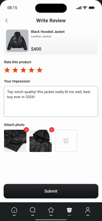
For clothes, a photo from another buyer is worth more than a star rating. The reviews page leads with the average and how ratings are spread, then shows each review with the buyer's own photos. Writing one takes a rating, a sentence and up to a few pictures.
One design system behind every screen
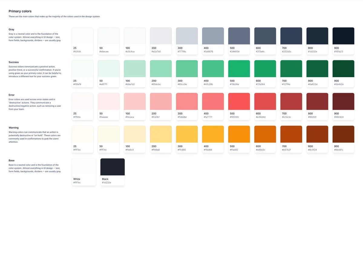
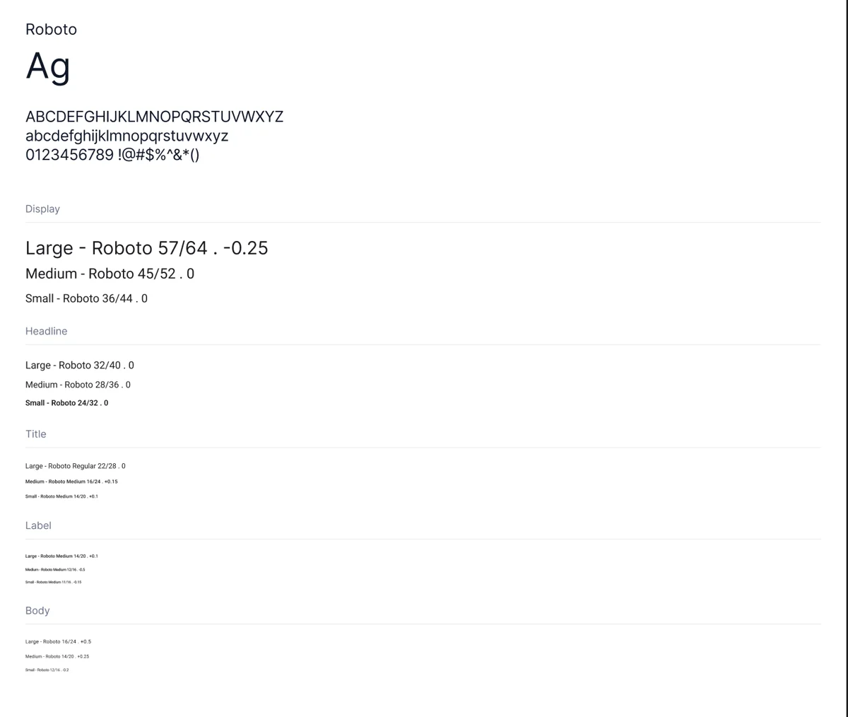
To keep 75+ screens consistent, I built the foundations first: a Roboto type scale from Display to Body, and color ramps for gray, success, error and warning, eleven steps each, checked against WCAG 2.1 contrast. Orange is kept for prices and ratings only, so the eye goes to what matters.
Result
A complete, build-ready store: every screen, every state, one system.
The handoff covered the full journey, from welcome to review, with empty and error states for each flow and a design system developers could build from directly. No screen was left as "we'll figure it out in development".
What I'd measure after launch
- Whether filter chips cut the time to find an item, compared to a separate filter page.
- Add-to-cart rate from the home best seller cards.
- Where people drop off in checkout, step by step.