Case study · Mobile app
Work Mate · HRIS App
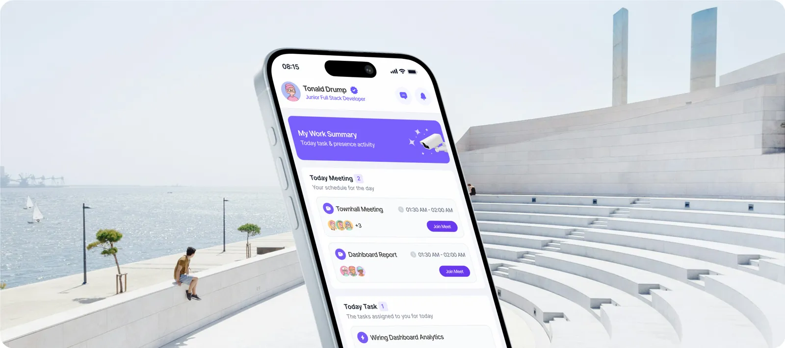
An HR app that makes work feel lighter. Clock in, manage tasks, claim expenses and request leave in one place, with a burnout tracker that tells you when it's time to take a break.
Challenge
HR apps feel like paperwork. Employees open them only when they have to.
In most companies, attendance lives in one tool, leave in another, expenses in a spreadsheet and payroll in an email. Each task is small, but together they eat time and attention, and nothing in them looks out for the person doing the work.
The brief was to bring the everyday HR jobs into one mobile app, and make it something people actually want to open:
- One place for daily HR tasks: attendance, tasks, expenses, leave, payroll.
- Less admin, fewer mistakes for both employees and HR.
- Care for well-being: notice when someone is overloaded, and reward progress.
Approach
Start from the jobs people need done, not from HR modules.
I used the Jobs To Be Done framework to write down what an employee is really trying to do in each moment. Every feature in the app had to answer one of these jobs. If it didn't, it didn't make the cut.
When I clock in or out
I want to record my attendance easily
So my work hours are logged accurately
When I request time off
I want to manage my leave easily
So I keep a healthy work-life balance
When I manage my tasks
I want to organize and prioritize my workload
So I stay on track and meet deadlines
When I feel overwhelmed at work
I want to see my burnout level
So I take breaks and ask for support
When I reach a goal
I want to earn badges for it
So I stay motivated and engaged
When I submit expenses
I want to claim them quickly
So I get reimbursed without hassle
When I receive my paycheck
I want payroll to just work
So I'm paid on time and correctly
When I look for training
I want to improve my skills
So I can grow my career
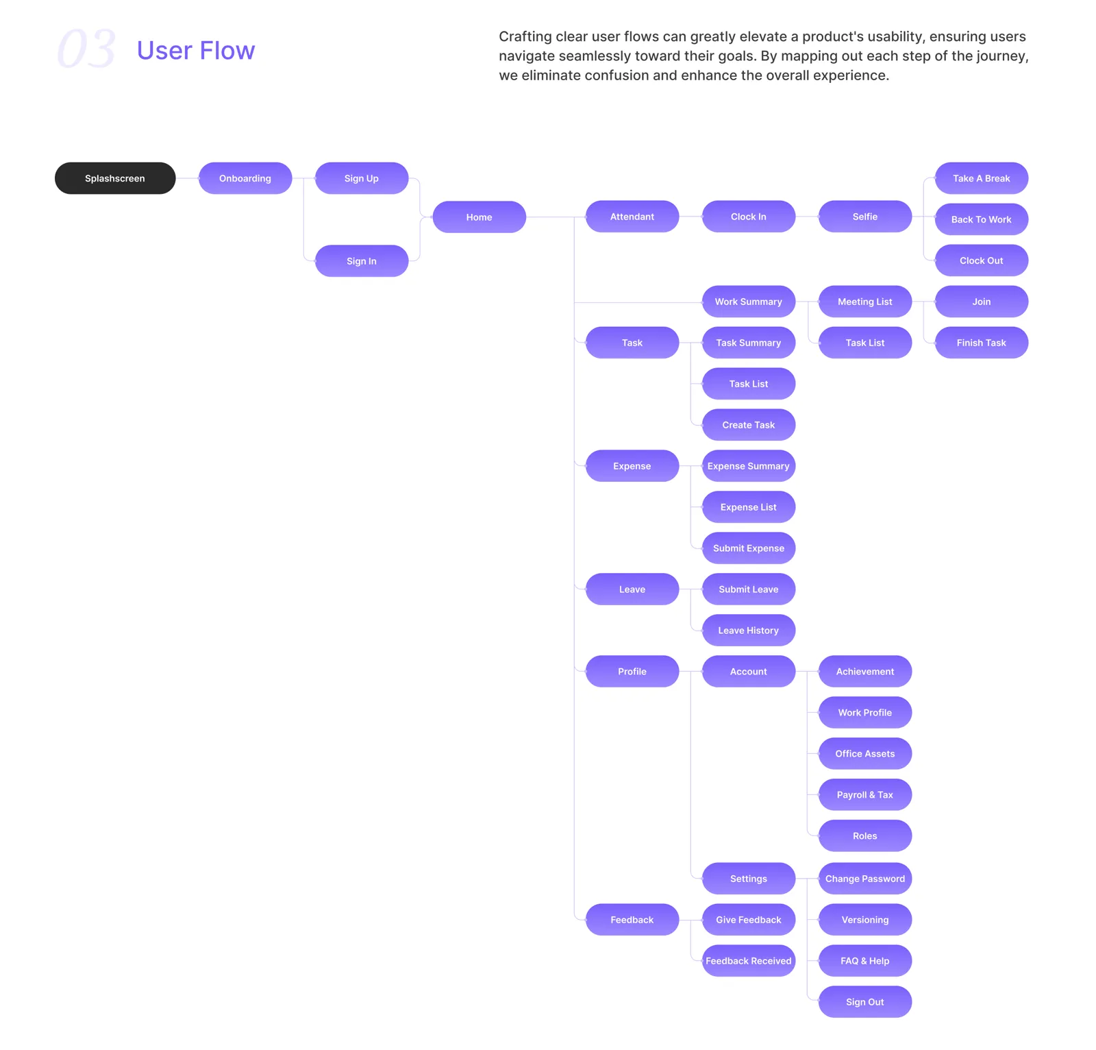
Those jobs became the user flow: one home screen that branches into attendance, tasks, expenses, leave, profile and feedback, each only one tap away.
Process
Six decisions that shaped the app.
Onboarding that shows the app, then gets out of the way
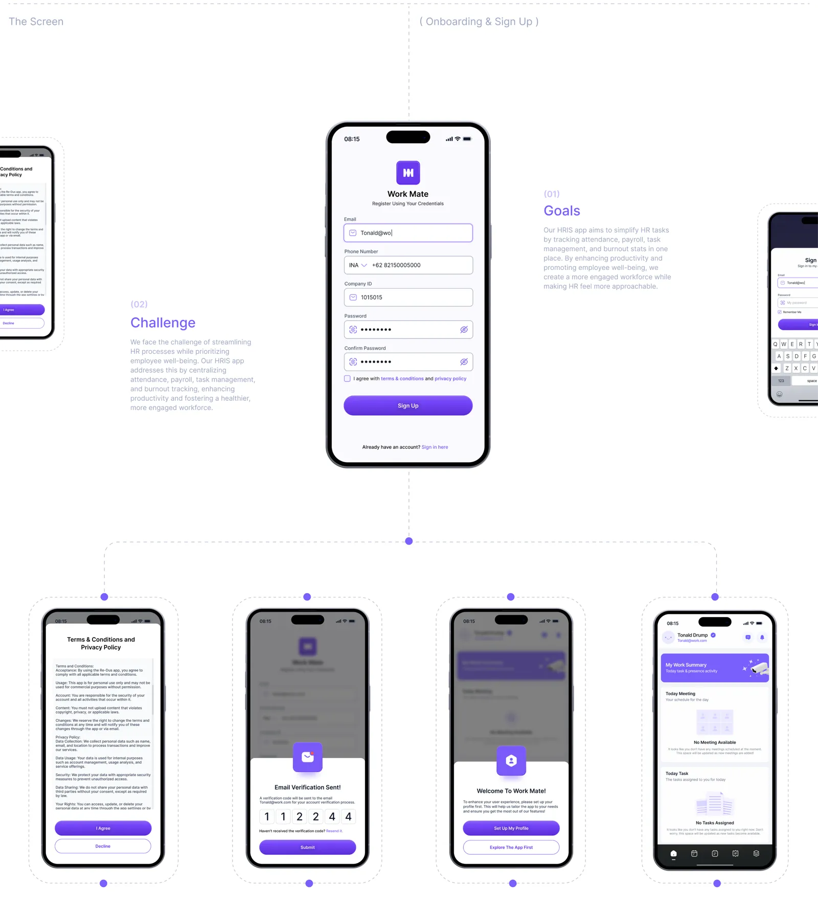
Three short onboarding screens each make one promise and back it with a live preview of the real product: today's meetings and tasks, a workload and stress chart, and the badges people can earn. Skip is always there for anyone who wants to start right away.
Sign-up asks only for what HR needs to match you to your company: email, phone and company ID. Fields light up as you type, the terms open in a sheet instead of a new page, and a six-digit code confirms the email. After that, people can set up their profile or explore the app first, so nobody is forced through a long form before they see any value.
Home is a daily briefing, not a menu
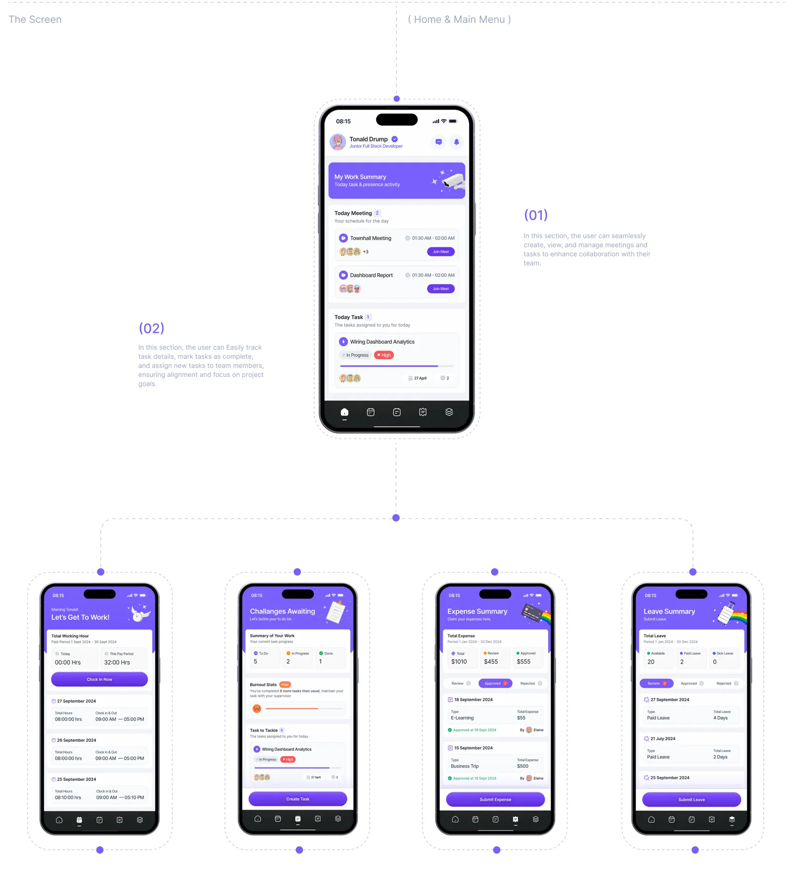
Opening the app answers "what does my day look like?": a work summary, today's meetings with a one-tap Join, and today's tasks with their progress. Attendance, tasks, expenses and leave each get their own summary screen with the key numbers on top.
Clocking in you can trust, in a few seconds
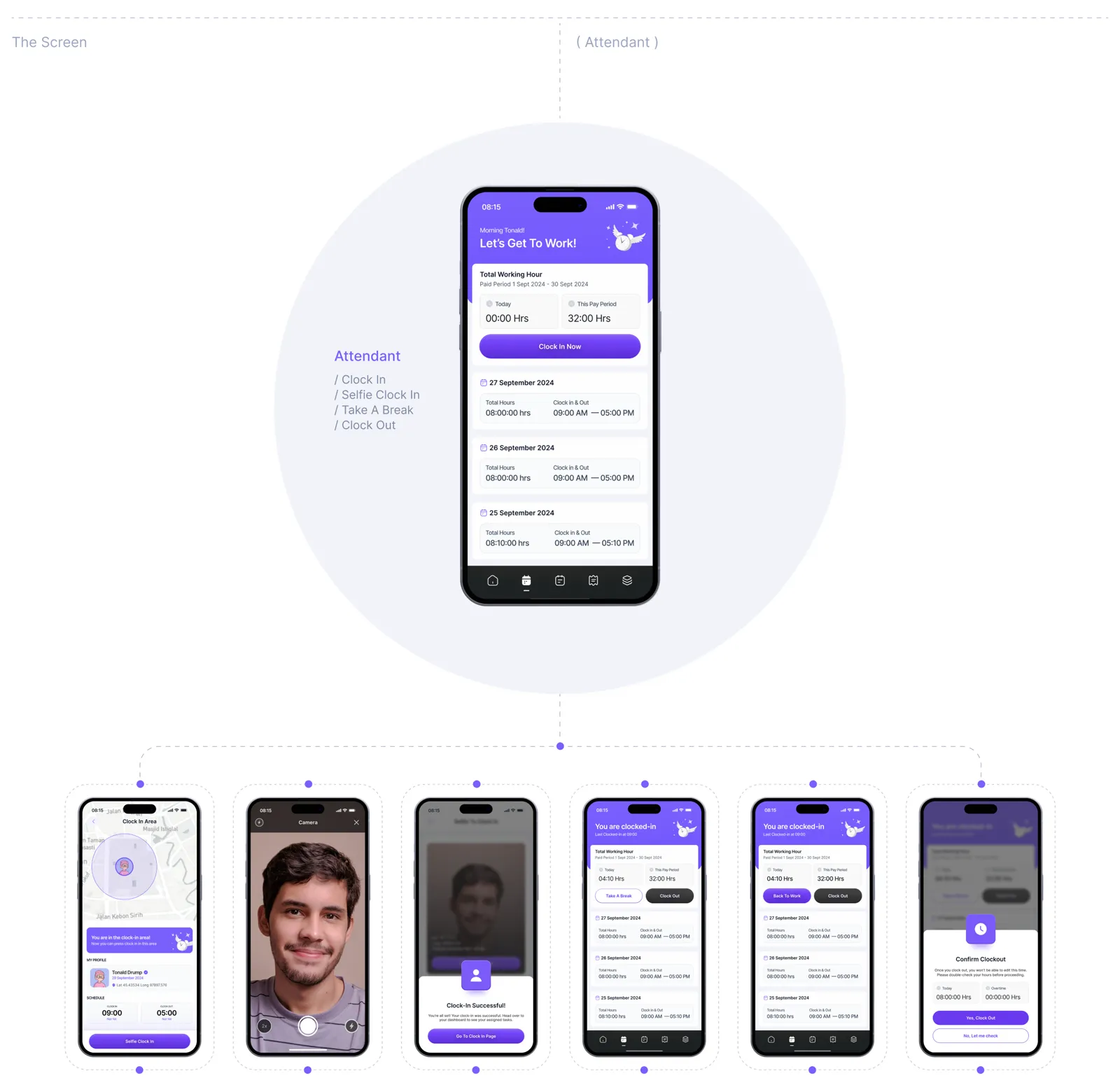
Attendance is the action people repeat every day, so it had to be fast but still reliable for HR. The app checks you're inside the office area, asks for a quick selfie, and confirms with a clear success state. Taking a break and coming back are one tap each. Clocking out shows a warning first, because hours can't be edited afterwards.
Tasks that motivate, with burnout in view
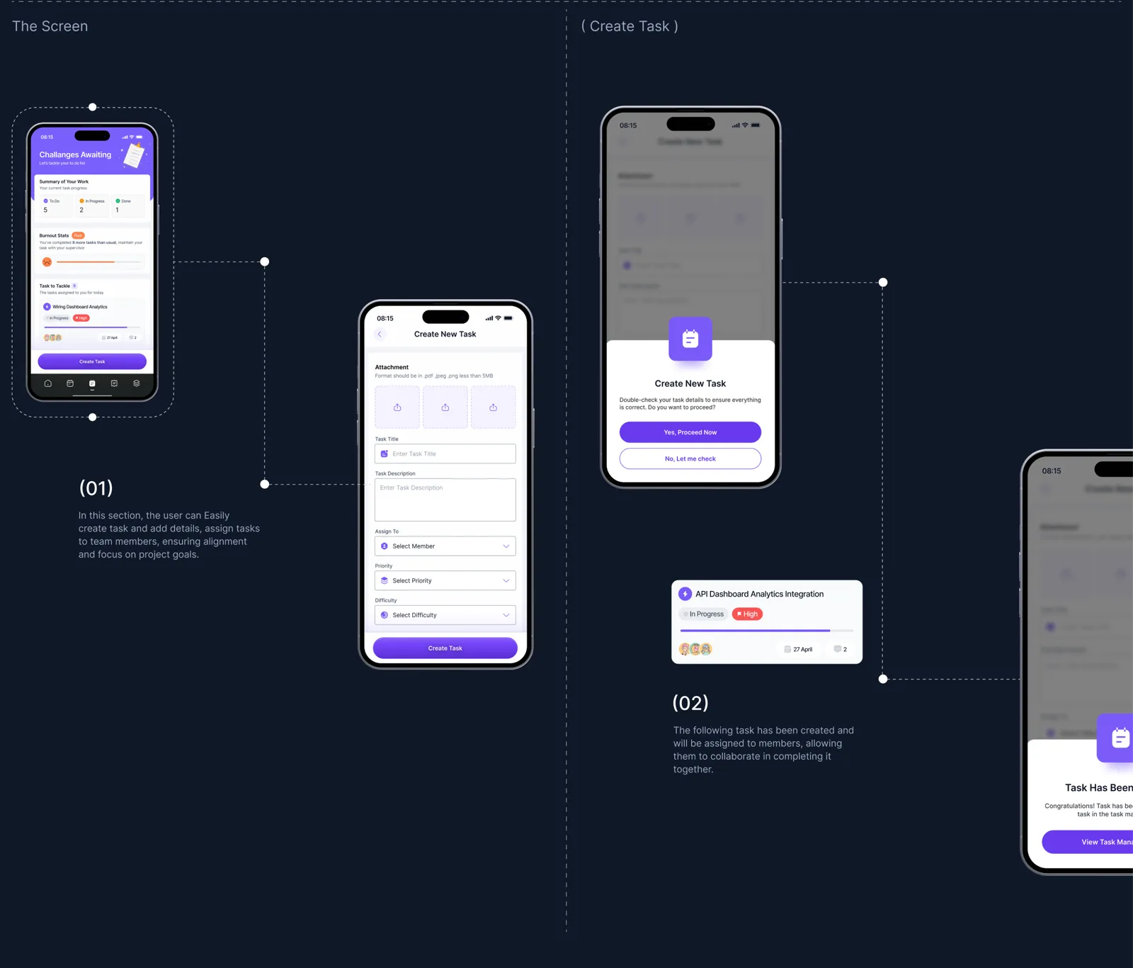
The task screen is framed as "Challenges Awaiting", with a burnout stat right next to the work. When someone completes far more tasks than usual, the app says so and suggests talking to their supervisor. Creating a task takes one form: title, description, assignee, priority and difficulty, then a confirmation before it's sent to the team.
Expenses without the paperwork
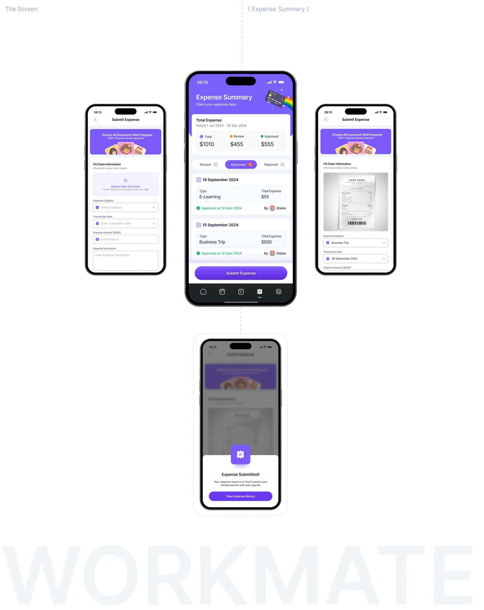
Claiming an expense is a photo of the receipt, a category, an amount and a date. The summary shows the total and how much is in review, approved or rejected, and each claim says who approved it and when, so nobody has to chase HR for an update. Leave requests follow the same pattern, so learning one teaches the other.
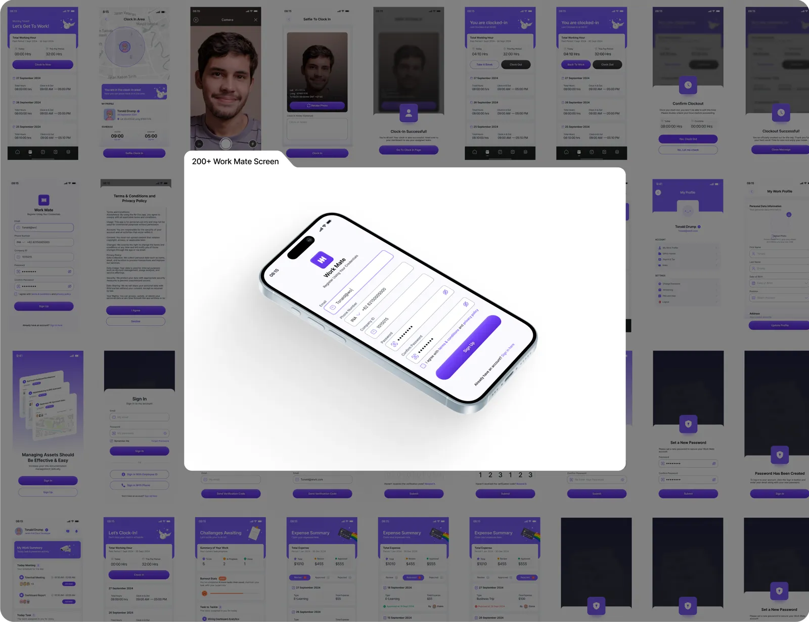
A calm system behind 200+ screens
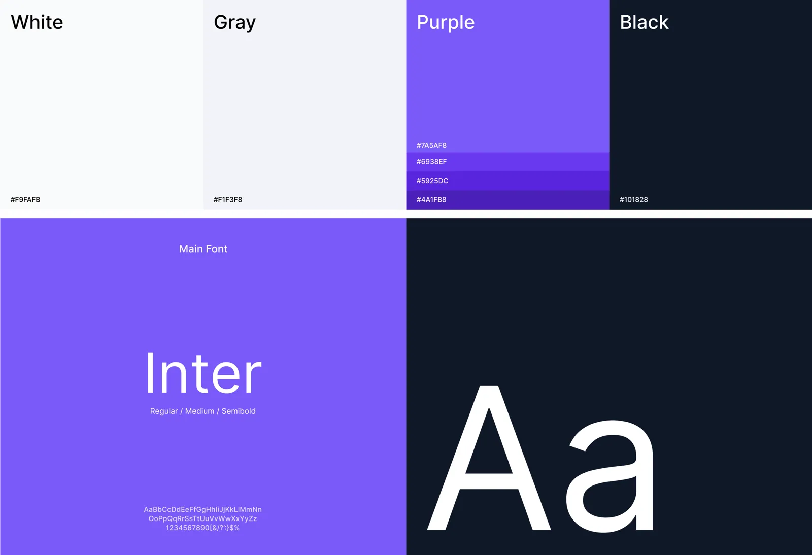
A purple accent marks what you can act on, with soft grays for everything else and near-black for text. Inter in three weights keeps dense screens like payroll and expense lists easy to read. Every module uses the same summary card, status tag and bottom sheet, which is what made 200+ screens feel like one app.
Result
One app for the whole workday, from clock-in to payroll.
The final design covers 200+ screens across onboarding, attendance, tasks, expenses, leave, profile, payroll, messages and notifications, with empty states and confirmations for each. Everything is built on one shared set of components, ready for development.
What I'd measure after launch
- Average time to clock in, and how often people fail the location check.
- How long expense claims take from submission to approval.
- Whether burnout alerts lead to more breaks or more conversations with supervisors.